 Is your marketing a hap-hazard approach chasing the latest ad idea or flashy promise of new clients that comes your way but does nothing to build lasting authority in your market place.
Do you dream of a marketing plan that would have lasting results? A plan laser focused to bring in new business over the long term?
There are a ton of experts out there saying that you need to blog more, do more social media and generally your success means that you have to work more. I want to let you now that this article is not about telling you how you need to work more, blog more or tweet constantly. If you enjoy doing those things then fine, go for it. This article is intended to give you and overview of some fundamentals to ensure your website traffic has the maximum conversion and ROI of new clients and business.
Website traffic is a commodity. Like fuel for your car it’s expensive to run ads and perform strategic SEO. And like that gas you put in your car, you do not want to waste a drop of it. Traffic to your website will not get you the client lead if your website is not ready for it. This guide will give you a good start on identifying and making the changes needed to maximize your website’s lead generating potential.
Why Your website is not converting clients to contact/call your firm?
“You can lead the horse to water but you cannot make them drink? “ I’m sure you’ve heard that phrase and if you have ever spent much time around horses you may know why you cannot make them drink. (My answer is at the end of this post.)
Why can’t you convert visitors even if they need your services? They may hear about you, see your services and products, visit your website but they never order, call or contact you. Obviously you must have systems in place to lead new clients to your offer and service. But, before you do, remove any barriers that might send them away and you’ll be one step closer to making your website home page or landing pages a conversion machine.
Here are 4 of the common barriers that might be driving online visitors away from your website:
1) Speed matters!
I’m sure you have heard this before: “You have up to 8 seconds to engage your website visitor”. So, why should you believe this? Where did this idea come from?
Several main studies have all pointed to the fact speed matters:
- Google research stemming back all the way to 2006 (ancient history for internet users) discovered that a change in results from 10 results on the page that loading in .4 seconds vs a 30 page result loading in a mere .9 seconds caused a decrease in traffic and ad revenues by as much as 20%. If you want to argue that Google doesn’t know what they are talking about then why do they own over 3/4 of the search market and last quarter’s profit was 3.8 billion!
- Plus, probably one of the most quoted is the Zona research from as far back as 1999 that up to 1/3 of visitors were lost if a site took more than 8 seconds to download. As broadband became more prevalent the research from Akamai found that in 2006 1/3 of visitors left a page if it took more than 4 seconds to download.
The consensus is: website load speed matters!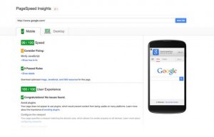
Check your speed of your website and take the action necessary to make it load in less than 4 seconds.
Now also check your major competitors website. Use our free online tool and you can do both at the same time, plus a bunch of metrics to help you. Your goal is to beat them in speed (our online tool can also check competitors along side your website). The reason I suggest this is that some website industries do load slower than others and usability is important also. Google maps is a prime example or real estate property search engines and MLS feeds. If your user is accustom to a high graphic content (and slower speeds) on competitors websites, then you may need to weigh those expectations against speed and checking against several of your top competitors is a good way to gauge your website.
But for attorney websites please note: we have done the research and Speed is always important.
 2) Your website message: KISS – yes I’m going to say it- Keep it simple stupid.
Decide what business you are in!
Ask yourself these questions:
- What are you or your firm passionate about solving for your clients?
- Who is your audience, and what are they looking for?
- How do they benefit by using you or your business? (reference the first two questions)
- Then, Don’t tell us what you do but tell us in a simple manner and clearly how you help us.
One of Gestalt psychology’s central principles is the Law of Prägnanz. This law (literally, the “law of pithiness” in German) states that we order all our experiences in a symmetrical, simple manner. Even on the web our visitors might be frightened away if our message is not clear, simple and what they want to hear in just seconds.
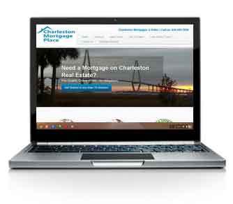
So, visible on the page when your client first visits the site give them your simple message about what they want, how you can help and a concise call to action (Call for a free consultation or Get Your (not our) Free Online guide, Your help starts here, etc. )
Why is a simple and clear message important?
 Tim Ash, author of the bestselling book Landing Page Optimization is a leading marketing and neuroscience expert states that decisions are not always made with the conscious part of our brain but through more primitive areas that rely on simpler less complicated choices. Overly complex decisions can cause a fight or flight reflex in the brain and drive visitors away.
In 2007, neuroscientists at the University of California Los Angeles scanned the brains of people watching commercials during the Super Bowl. While viewing advertisement during the game, subjects were scanned by a functional magnetic resonance imagining (fMRI) machine. Results of the research clearly show that while watching some less complicated simple commercials stimulated empathy and connection, some of the most expensive ads (and complex) provoked anxiety and fear. Complex messages and information and startling images can and do tend to evoke the treat-detector region of the brain. So for an attorney website that means; get rid of the handcuffs and ambulances and replace them with smiling faces. Make your message empathetic, simple, clear and always about them (your customer) not you and your business or firm.
There is a ton of additional neurological research that backs up the principles that simple choices are always safer. If your interested :
![]() Marketing and Neuroscience – What Drives Customer Decisions? – to
Marketing and Neuroscience – What Drives Customer Decisions? – to
![]() Googles landmark study in 2010 ZMOT (Zero Moment of Truth), just to mention a few more.
Googles landmark study in 2010 ZMOT (Zero Moment of Truth), just to mention a few more.
Understand this formula from Tony Jeary in the book: Strategic Acceleration:
Clarity + Focus = Execution
In the 2015 B2B Web Usability Report, Nearly 50% of respondents said the #1 reason they left a website immediately was because of a lack of a message!
We evolved to move toward a simple less complicated direction. Get rid of the complicated landing pages and create a simple less complicated message. SPECIAL NOTE TO ATTORNEYS: If your still unable, or your partners are unwilling, to give up those scary photos of you and the law books in your carousel on your home page and move them to a bio section of your website, then at least hire a competent web designer to build you a separate website dedicated to a simple clear message that will bring new business for your firm.
3) Make Sure you are Mobile Ready (Period!).
If your website is not currently easily viewable across all devices you are missing business. Google is not only noting mobile ready sites in smartphone search results, but has algorithms that lower your chances of being found in search engines if your website is not mobile friendly. More importantly, according to many recent marketing studies early in 2015, mobile and tablet traffic in the US is about 1/3 of the total internet traffic. This is a huge increase from 23.4% of total traffic from the latter part of 2012. (According to marketing and publishing firm – Walker Sands Communication’s)
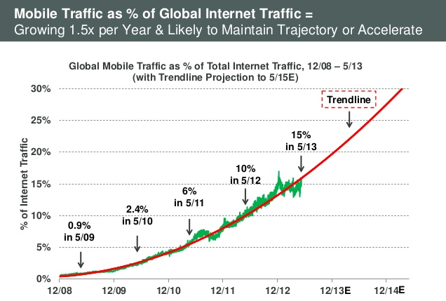
(above graph provided by: A Kleinger Perkins Caufield & Byers (KPCB) 2013 internet trends report )
4) Keep your navigation simple and exactly what your visitor expects.
Some of this is starting to overlap but don’t use your website as a design experiment. Keep menus where they should be and what they should be. Allow visitors to easily move around your site and reach there ZMOT (Zero Moment of Truth). Remember that visitors want things simple and you must organize the information on your website in a simple and structured way. Allow your menu to be what your client might expect and don’t try to be clever or distracting to your visitors. Clearly mark your products and services and for attorneys, clear tabs to your services or practice areas. Think about the path that you might want your clients to take and design menus around that giving them the information that they are seeking.
Oh finally, Why can you lead a horse to water but not make them drink? Simply, they are prey animals that have evolved to stay alive by successfully sourcing out danger. They need water and lots of it, but if you do not take away the dangers they’ll never drop their heads to drink. Remove the distractions and let them clearly see the water they so desperately need and desire – they’ll drink.


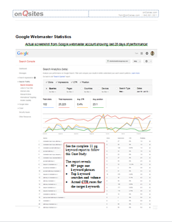 This study is not available to the general public. There is no obligation to hire us, but please register so we know that you are an Attorney, Mortgage Broker, Real Estate Broker/Agent, Medical Practitioner or other business professional. Once approved, a link to access the study will be emailed to you.